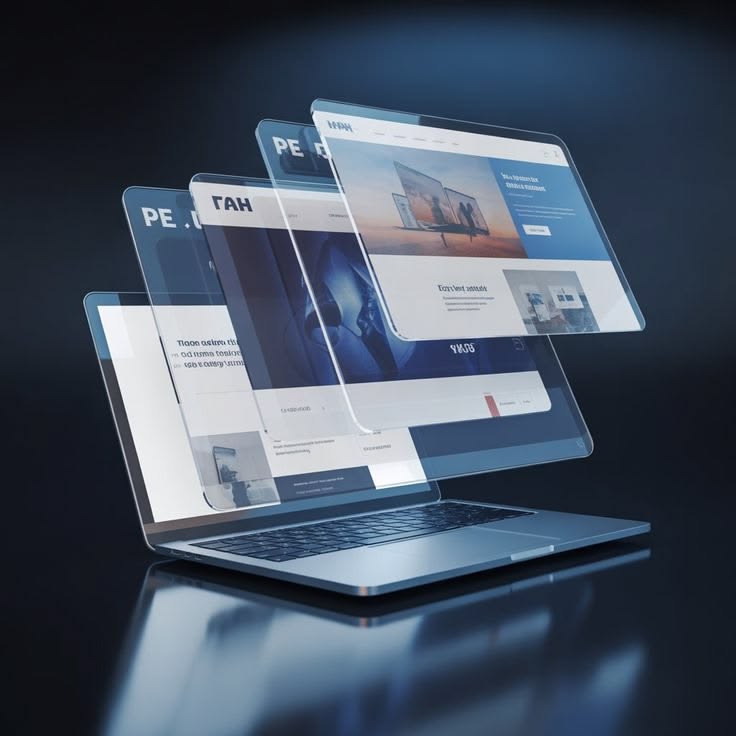
Modern websites, applications, games, and digital platforms must work perfectly across thousands of different screen sizes and devices. From smartphones and tablets to laptops, gaming monitors, and smart TVs, users now access the internet using a wide range of displays.
Because of this, Screen Size Checker Tools have become extremely important for developers, designers, gamers, bloggers, and general users. These tools help instantly detect screen dimensions, viewport size, resolution, device ratio, and display compatibility directly from a browser.
In 2026, responsive design and display optimization are more important than ever. A Free Screen Size Checker Tool helps users ensure websites, applications, and digital content appear correctly on all devices without needing software installation.
This complete guide explains everything about screen size checker tools, how they work, why they are important, and how they help improve digital experiences.
What is a Screen Size Checker Tool?
A Screen Size Checker Tool is an online utility that detects the dimensions of a device screen and browser viewport.
These tools usually display:
- Screen width
- Screen height
- Browser viewport size
- Device pixel ratio
- Screen orientation
- Resolution information
Most tools work instantly through web browsers.
Why Screen Size Matters
Different devices use different display sizes.
Examples include:
- Smartphones
- Tablets
- Laptops
- Desktop monitors
- Ultrawide displays
- Smart TVs
Websites and applications must adapt properly to all screen sizes for the best user experience.
Understanding Screen Resolution
Screen resolution refers to the total number of pixels displayed on a screen.
It is written as:
Width × Height
Examples:
- 1366 × 768
- 1920 × 1080
- 2560 × 1440
- 3840 × 2160
Higher resolutions provide sharper visuals and more detail.
Difference Between Screen Size and Resolution
Many users confuse screen size with resolution.
Screen Size
Measured in inches.
Examples:
- 15.6-inch laptop
- 27-inch monitor
Resolution
Measures the number of pixels displayed.
Two screens can have the same size but different resolutions.
Higher resolutions usually appear sharper.
What Are Pixels?
Pixels are tiny digital dots that create images, text, and videos on screens.
Millions of pixels work together to display visual content.
More pixels generally mean:
- Better detail
- Improved sharpness
- Higher image quality
Modern devices use advanced pixel technologies for better visuals.
Common Screen Sizes in 2026
Popular screen categories include:
Smartphones
- 5-inch to 7-inch displays
Tablets
- 8-inch to 13-inch displays
Laptops
- 13-inch to 17-inch displays
Monitors
- 24-inch
- 27-inch
- 32-inch
- Ultrawide monitors
Display sizes continue growing as technology advances.
Common Screen Resolutions
HD Resolution
- 1280 × 720
Mostly used in budget devices.
Full HD (1080p)
- 1920 × 1080
Most common resolution globally.
2K Resolution
- 2560 × 1440
Popular for gaming and professional work.
4K Ultra HD
- 3840 × 2160
Provides ultra-sharp visuals.
8K Resolution
- 7680 × 4320
Used in premium high-end displays.
What is Viewport Size?
Viewport refers to the visible area inside a web browser.
Different devices have different viewport sizes depending on:
- Screen dimensions
- Browser UI
- Device scaling
Developers use viewport testing for responsive design optimization.
What is Device Pixel Ratio?
Device Pixel Ratio (DPR) measures how physical pixels relate to CSS pixels.
Example:
- DPR 2 means one CSS pixel equals two physical pixels.
High DPR screens provide:
- Better sharpness
- Clearer text
- Improved graphics
Modern smartphones often use high DPR displays.
Why Use a Free Screen Size Checker Tool?
A screen size checker helps users:
- Detect device dimensions
- Test responsive websites
- Improve UI/UX design
- Troubleshoot display issues
- Optimize mobile layouts
These tools are useful for both beginners and professionals.
Benefits for Web Developers
Developers use screen size tools to ensure websites work correctly across all devices.
Benefits include:
- Responsive testing
- Mobile optimization
- Cross-device compatibility
- Layout debugging
Responsive websites improve both SEO and user experience.
Benefits for Designers
Graphic and UI designers need accurate display testing.
Screen size tools help with:
- Interface design
- Layout alignment
- Responsive previews
- Pixel-perfect design
Professional design work depends heavily on display accuracy.
Benefits for Gamers
Gamers use screen testing tools to optimize gaming setups.
Higher resolutions improve:
- Texture detail
- Visual immersion
- Gaming clarity
Screen size testing helps configure gaming monitors properly.
Benefits for Bloggers and Website Owners
Website owners must ensure websites display properly on:
- Mobile devices
- Tablets
- Desktops
- Ultrawide monitors
A screen size checker helps improve website usability and engagement.
Responsive Web Design Explained
Responsive design allows websites to automatically adapt to different screen sizes.
Responsive websites improve:
- Mobile usability
- SEO rankings
- User experience
- Conversion rates
Screen size testing is essential for responsive development.
Importance of Mobile Optimization
Most internet users now browse using smartphones.
Poor mobile layouts can cause:
- High bounce rates
- Lower SEO rankings
- Poor user experience
Testing mobile screen sizes helps improve website performance.
Retina Displays Explained
Retina displays use very high pixel density for sharper visuals.
Advantages include:
- Smooth text
- Better image quality
- Reduced visible pixels
Apple popularized Retina display technology.
High DPI Displays in 2026
High-DPI screens are increasingly common.
Benefits include:
- Better clarity
- Reduced eye strain
- Improved productivity
- Enhanced multimedia quality
Premium devices commonly feature high-density displays.
Screen Scaling Explained
Scaling changes interface size on high-resolution displays.
Common scaling levels:
- 100%
- 125%
- 150%
- 200%
Improper scaling can cause blurry visuals or layout problems.
Common Display Problems
Users often experience issues such as:
- Blurry screens
- Incorrect scaling
- Stretched images
- Black bars
- Wrong aspect ratios
A screen size checker helps diagnose these issues quickly.
Native Resolution Explained
Native resolution is the original designed resolution of a display.
Using native resolution provides:
- Best sharpness
- Correct scaling
- Improved image quality
Lower resolutions may reduce clarity.
Ultrawide Monitors
Ultrawide displays are increasingly popular for gaming and productivity.
Popular ultrawide resolutions include:
- 2560 × 1080
- 3440 × 1440
- 5120 × 1440
Advantages:
- Better multitasking
- More workspace
- Immersive gaming
Screen Size and Gaming Performance
Higher resolutions require stronger GPUs.
Popular gaming resolutions:
1080p Gaming
- Higher FPS
- Lower GPU requirements
1440p Gaming
- Balanced performance and quality
4K Gaming
- Ultra-sharp visuals
- Demanding hardware requirements
Gamers often balance resolution with refresh rate.
Refresh Rate vs Screen Resolution
Refresh rate measures how often a screen updates each second.
Common refresh rates:
- 60Hz
- 120Hz
- 144Hz
- 240Hz
High refresh rates improve smoothness, especially in gaming.
Screen Size Testing for SEO
Google prioritizes mobile-friendly websites.
Responsive testing improves:
- Mobile usability
- SEO performance
- User engagement
- Page experience
Screen size testing is important for modern SEO strategies.
Importance of Browser Compatibility Testing
Different browsers may display layouts differently.
Testing helps ensure compatibility across:
- Chrome
- Firefox
- Safari
- Edge
Proper testing improves consistency across devices.
AI and Future Display Technology
Artificial intelligence is improving display systems rapidly.
Future technologies include:
- AI-based scaling
- Smart resolution optimization
- Foldable screens
- Transparent displays
- Advanced OLED panels
Display technology continues evolving rapidly in 2026.
Best Uses of a Screen Size Checker Tool
A screen size checker is useful for:
- Developers
- Designers
- Gamers
- Students
- Bloggers
- Businesses
- Content creators
These tools improve compatibility and user experience.
Why Every Website Needs Screen Size Testing
Websites must function correctly on all devices.
Testing helps:
- Reduce layout errors
- Improve responsiveness
- Increase mobile compatibility
- Improve SEO rankings
Responsive websites are essential for success in modern web development.
Tips for Better Display Optimization
To improve display quality:
- Use native resolution
- Update graphics drivers
- Test multiple screen sizes
- Optimize responsive layouts
- Use proper scaling
These steps improve user experience significantly.
Future of Screen Size Testing Tools
Future screen testing tools may include:
- AI-powered responsive testing
- Real-time device simulation
- Advanced viewport analysis
- Smart layout optimization
Technology continues making display testing easier and more accurate.